
This morning, 5 August, I did my usual read on gold before the London session, and it handed me a perfect example of why the question of what is the best time frame to trade gold is asked so often and answered so badly. On the one hour chart everything looked clean. Price had reclaimed both the 34 and 89 period moving averages, both were turning up, and momentum readings were up near the warm end of the scale. If the hour chart were the whole world, you would call that an uptrend and go looking for a way in.
But the hour chart does not know what is on the calendar. The US Bureau of Labor Statistics publishes the July jobs report on Friday, and the entire market is standing still waiting for it. A chart cannot see a date. Only you can.
So, what is the best time frame to trade gold? People want a number back: five minutes, one hour, four hours, daily. I have never been able to give that answer honestly, because the number is not the thing that decides your outcome. What decides it is whether you read more than one time frame, and whether each one has a job you can state out loud.
A smaller time frame does not give you more information
This is the part that took me years to accept, so let me put a number on it.
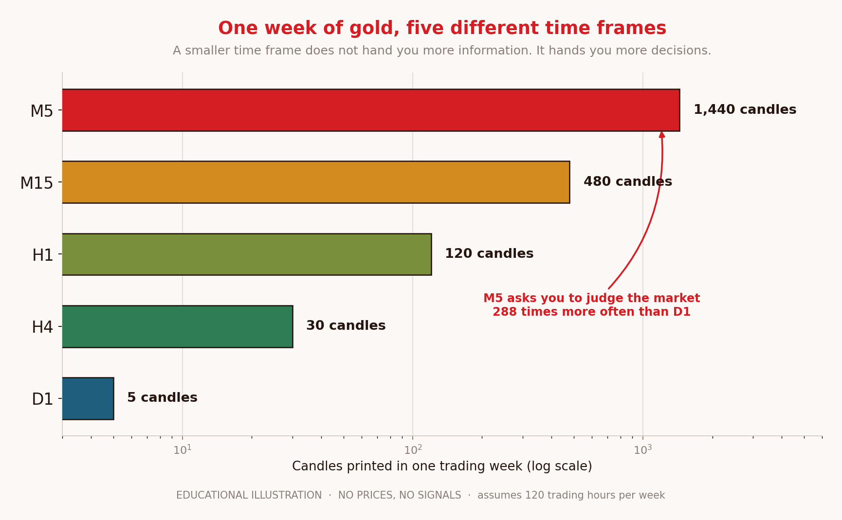
Gold trades around the clock from Sunday evening to Friday evening, which is roughly 120 trading hours in a week. Do the arithmetic on what that means for each chart. The daily chart prints 5 candles a week. The four hour prints 30. The one hour prints 120. The fifteen minute prints 480. The five minute prints 1,440. Drop to one minute and it is 7,200.
So moving from the daily to the five minute does not multiply your information by 288. The same week happened. The same buyers and sellers did the same things. What gets multiplied by 288 is the number of times the chart invites you to have an opinion.
That is the trade you are making when you drop a time frame, and almost nobody names it out loud. More candles means more entries that look valid, more stops that look tight, more moments where doing nothing feels like missing out. If your discipline is not already solid, the smaller chart will find that out faster than anything else in this business.
The bill arrives with the candles
There is a second cost that follows from the same arithmetic, and it is easier to ignore because it never shows up as a losing trade.
Every time you enter, you pay the spread. Suppose it costs you thirty cents an ounce to get in and out, which is a reasonable round number to think with rather than a quote from any particular broker. A trader taking twenty entries a week off a five minute chart pays six dollars an ounce a week in spread alone, which is a little over three hundred dollars an ounce across a year. A trader taking two entries a week from a four hour chart pays about thirty dollars an ounce across the same year.
Same market, same year, ten times the cost, and none of it depends on being right. That is not an argument that fast trading cannot work. It is an argument that the faster chart has to be meaningfully better at picking trades just to break even against the slower one, and most of us are not that much better at anything.
The three time frames I actually read, and the job of each
I do not pick one. I read three, in a fixed order, and each one is only allowed to answer its own question. This is step two of the method I follow, and the order matters more than the specific charts.
The slow chart decides the story
The daily and the four hour tell me which way this market has been resolving and where the levels that matter actually sit. This is where structure lives, where the zones that have caused real reactions are drawn, and where I decide whether I am looking for longs, looking for shorts, or looking at nothing. Most weeks it takes ten minutes and I do not touch it again.
The middle chart decides the timing
The one hour is where I watch how price behaves as it approaches the level the slow chart drew. Is it arriving with force or drifting in tired? Did the last push hold or get given straight back? This is also where I notice things like price stretching a long way from its moving averages, which is a hint that the next move might be a pullback rather than a continuation. It is a hint, not a signal, and I want to be careful with that word.
The fast chart decides only the entry
The fifteen or five minute chart gets exactly one job: to show me the trigger I already wrote down before I got here. It does not get a vote on direction. It does not get to talk me into a trade that the slow chart never authorised. The moment the fast chart starts generating my ideas rather than executing them, I have stopped reading gold and started reacting to it.
That last sentence is the whole article, if you are in a hurry.
The time frame nobody names: the calendar
Here is what this morning made obvious. You can read three charts perfectly and still be caught out, because there is a fourth clock running that has nothing to do with candles.
Three scheduled events dominate that clock. The US jobs report, formally the Employment Situation, is published twelve times a year, always at 08:30 New York time. Inflation figures follow the same rhythm, with the Consumer Price Index also published twelve times a year at 08:30. And the Federal Reserve holds eight scheduled meetings a year, releasing the minutes three weeks after each decision.
Add them up. Thirty two dated events in a year, which averages out to one roughly every eleven days. That is not many days out of the year, but they are not distributed like ordinary days, and on those mornings a five minute chart is close to useless. It shows you a structure that a single number can erase in a second.
Which is exactly the situation as I write this. The read on the hourly chart is constructive. The calendar says Friday morning, 08:30 New York, a number lands. Both things are true at once, and knowing both is the difference between a plan and a hope. What I do with that is not a prediction. It is a decision about behaviour: smaller size, or standing aside, or being in a position whose stop I accepted before the number existed.
Choose your time frame from your life, not from the market
When someone asks me which chart to use, my first question back is not about strategy. It is about their week.
If you have a job, a family, and forty spare minutes in the evening, the daily and four hour charts are not a compromise, they are the correct tool. You will see fewer opportunities and you will be able to prepare for each one properly. If you tried to trade a five minute chart on that schedule you would be catching the middle of moves you never saw start, which is a reliable way to arrive late and leave early.
If you genuinely have two or three uninterrupted hours at the same time each day, the one hour and fifteen minute pair becomes workable, because you can be present for the session rather than parachuting into it.
The mistake is choosing a fast chart because you want faster results. The chart has no idea how impatient you are. All it does is print more candles, and each one asks you the same question again.
The trap: changing time frame after a loss
I want to name a specific failure because I lived it for the better part of a year.
You take a loss on the hour chart. It stings. You think, if I had been on the fifteen minute I would have seen that coming, so you drop down. Now you are trading a chart you have never studied, with a stop that is too tight for the noise, and you are doing it while annoyed. The next loss comes faster, so you drop again.
By the end of that spiral I was on a five minute chart making dozens of decisions a week with rules I had written for a completely different market. Nothing was wrong with the five minute chart. Everything was wrong with the fact that I chose it as a reaction rather than a decision.
The fix is unglamorous. Pick your pair of time frames while calm, write them at the top of your journal, and treat any change as a decision that needs a written reason and a month of evidence. Not a mood.
What is the best time frame to trade gold, answered plainly
There is no single best one, and anyone who names a number without asking about your schedule is guessing at your life. What works is an order: a slow chart for the story, a middle chart for the timing, a fast chart for the entry only, and a calendar sitting above all three.
If you want one practical rule to take away, make it this. Never let your entry chart be the same chart that gave you the idea. The separation is what stops a candle from becoming a reason.
Where to go next
If you are new here, start here is the short introduction. The full method walks the whole sequence from mood to journal, and this article is really an expansion of its second step. It helps to pair it with what actually moves the price of gold, because the calendar only makes sense once you know why those releases matter, and with how the sessions behave, since the same time frame reads differently in London than it does at four in the morning.
There is also a free one page checklist, The Gold Read Card, which is the sequence I run before risking anything. No form to fill in. The longer version is my book, Reading Gold: A Repeatable Method for XAU/USD, and HARCOS is where I work alongside people who show their reads, including the ones that do not work out. Following costs nothing and the book is optional.
Trade the process, not the guess.
FAQ
What is the best time frame to trade gold for beginners?
Start slower than feels exciting. The daily and four hour charts give you fewer decisions, more time to prepare each one, and a stop distance that survives ordinary noise. You can always speed up later with evidence. Speeding up because you are impatient is how most beginners meet their worst week.
Can I trade gold on the five minute chart?
People do, but understand what you are signing up for. That chart prints around 1,440 candles a week against 5 on the daily, so it asks you to judge the market vastly more often. It suits somebody with a tested plan and hours of uninterrupted screen time, not somebody checking a phone between meetings.
How many time frames should I look at?
Three is enough and more than three usually creates contradictions you will resolve in favour of whatever you already wanted to do. Give each one a single job: story, timing, entry. If two charts disagree, the slower one wins.
Does the time frame change around news like the jobs report?
The chart does not change, but its usefulness does. Around a scheduled release, short term structure can be erased in seconds, so small time frame patterns become unreliable. That is a reason to adjust your behaviour, by standing aside or reducing size, rather than to switch charts.
Should I use moving averages to pick a time frame?
Moving averages describe what has already happened on whichever chart you put them on, so they cannot tell you which chart to use. They are useful as a quick read on whether price is stretched or settled. They are not a reason to trade on their own, and treating a crossing as an instruction is one of the more expensive habits in this market.
About the author
I am Marcus, founder of HARCOS INVEST FX. I am an entrepreneur and a working trader sharing how I read this market, not a teacher and not a guru. I spent my first two years hopping between charts looking for the one that would finally make me right, and the change came when I stopped asking which time frame was best and started giving each one a job it was not allowed to leave. Everything here is a personal perspective rather than a course, and no entry, stop or target discussed should be treated as a signal.
Trading gold (XAU/USD) is high risk, is usually traded with leverage so losses can exceed the amount you deposit, and this article is education about how one trader reads charts, not personal financial advice and not a recommendation to buy or sell. Any description of current market conditions reflects one moment on one morning and will be out of date quickly. Figures quoted come from the sources linked; calculations are my own and state their assumptions. Risk only money you can afford to lose.